Project Description
Back in 2009, Atlanta Cleaning Source owner Jenn Roland dreamed of expanding her client base and transitioning to a brick-and-mortar business. She wanted to differentiate her business from other cleaning companies in town and create an identity that would effectively communicate her mission, values and unique philosophy, but was unsure of how to do that in a concise and tangible way.
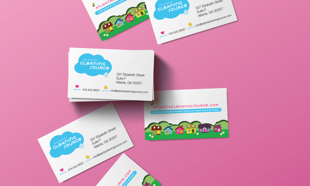
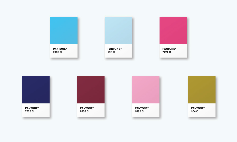
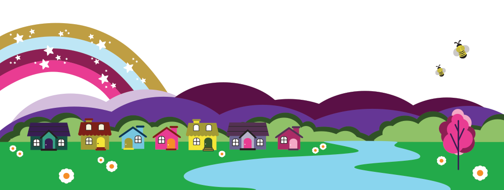
Her words to describe the characteristics that would define the Atlanta Cleaning Source as a brand were: diverse, loving, professional, different, detailed, progressive, and "the best." Jenn is also artist and knew that she wanted bright, vibrant colors and cute features, such as hearts, flowers, stars and rainbows in her logo, website and marketing materials that reflect the effervescent personality of the business and the feeling one gets from having a clean and organized home.
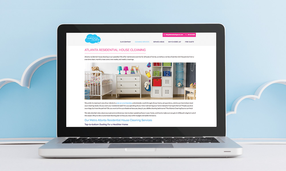
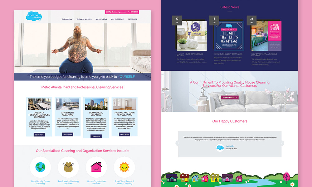
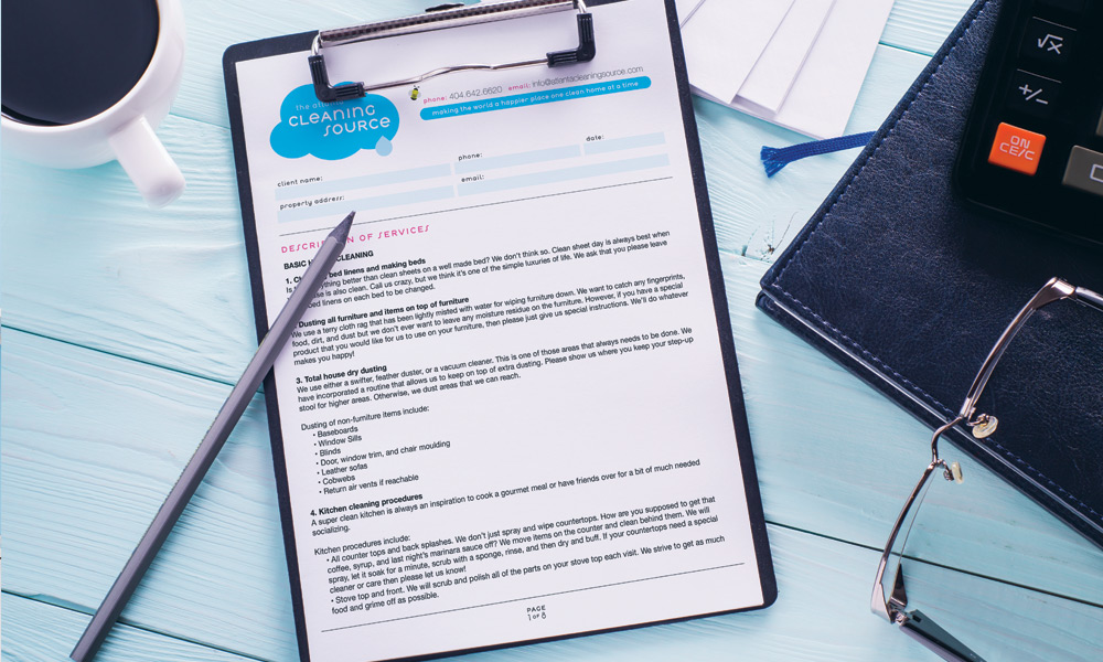
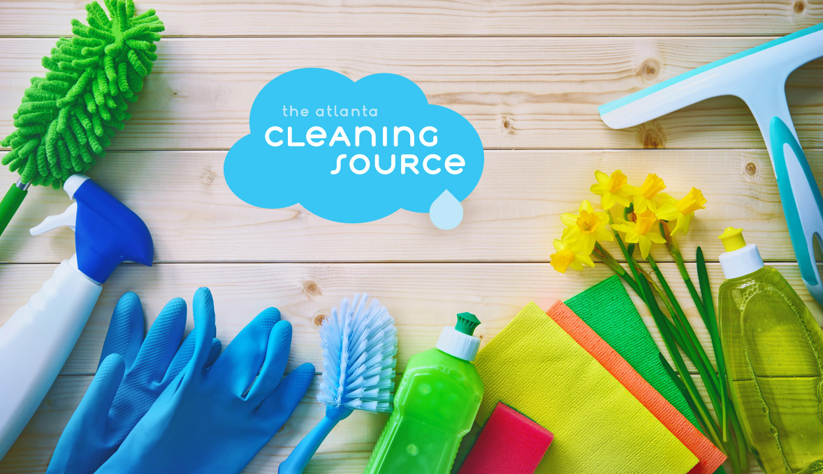
The logo design was inspired by Japanese kawaii style and its explosion of sunshine, sparkles and positivity. I paired lively colors with a clean, rounded sans serif typeface to create a modern, happy tone with friendly appeal. Marketing collateral followed suit with an extended visual language of colorful illustrations, icons and photographs to complement and reinforce brand purpose and positioning.