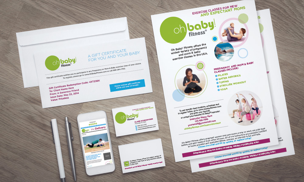
Project Description
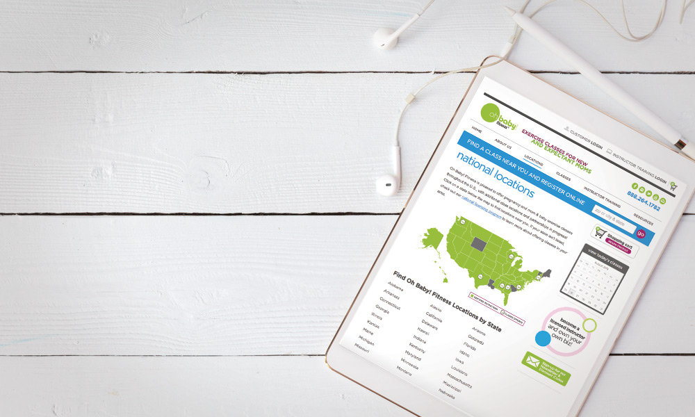
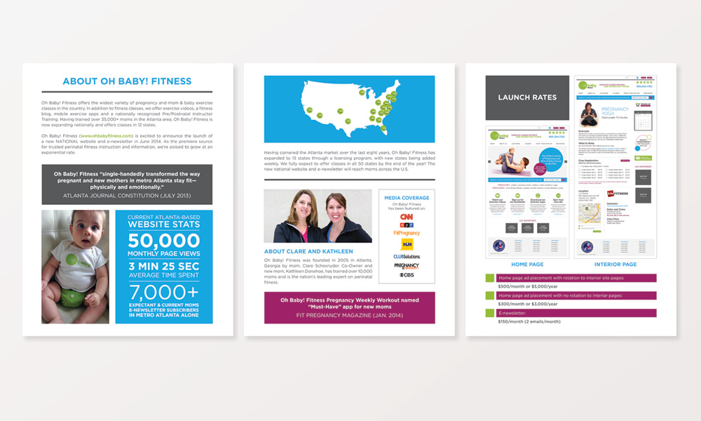
Established in 2005 in Atlanta with a single location, Oh Baby! Fitness now offers the widest variety of pregnancy and mom & baby exercise classes worldwide with certified instructors in 44 states and 15 countries.
The Oh Baby! Fitness logo and communications had been put together on the fly by its founder Clare Schexnyder with the help from a couple of friends and colleagues. By 2013, Clare and co-owner Kathleen Donahoe created a successful company that was different from what was already available in the pre- and post-natal fitness market. As the business grew from a local business into a national licensing program, its identity needed to evolve to fit its new role as a meaningful lifestyle brand.
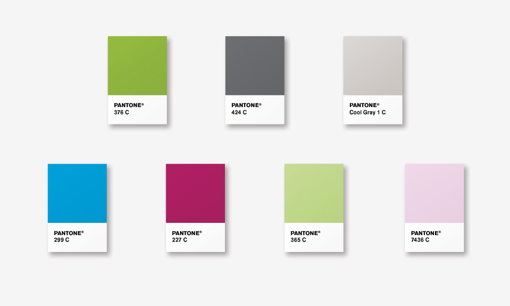
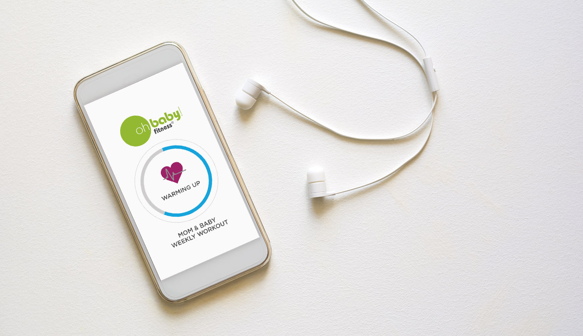
Color is an integral part of brand identity as it communicates a certain feeling to its audience. The original Oh Baby! website and marketing collateral was designed around a monochromatic color palette using shades and tints of green and grey. I developed an impact palette that would be expandable to the new website design, exercise apps and traditional advertising while still relating to the overall look and feel of the brand. The final result creates color harmony and balance and conveys a feeling of vibrant energy, openness and optimism.